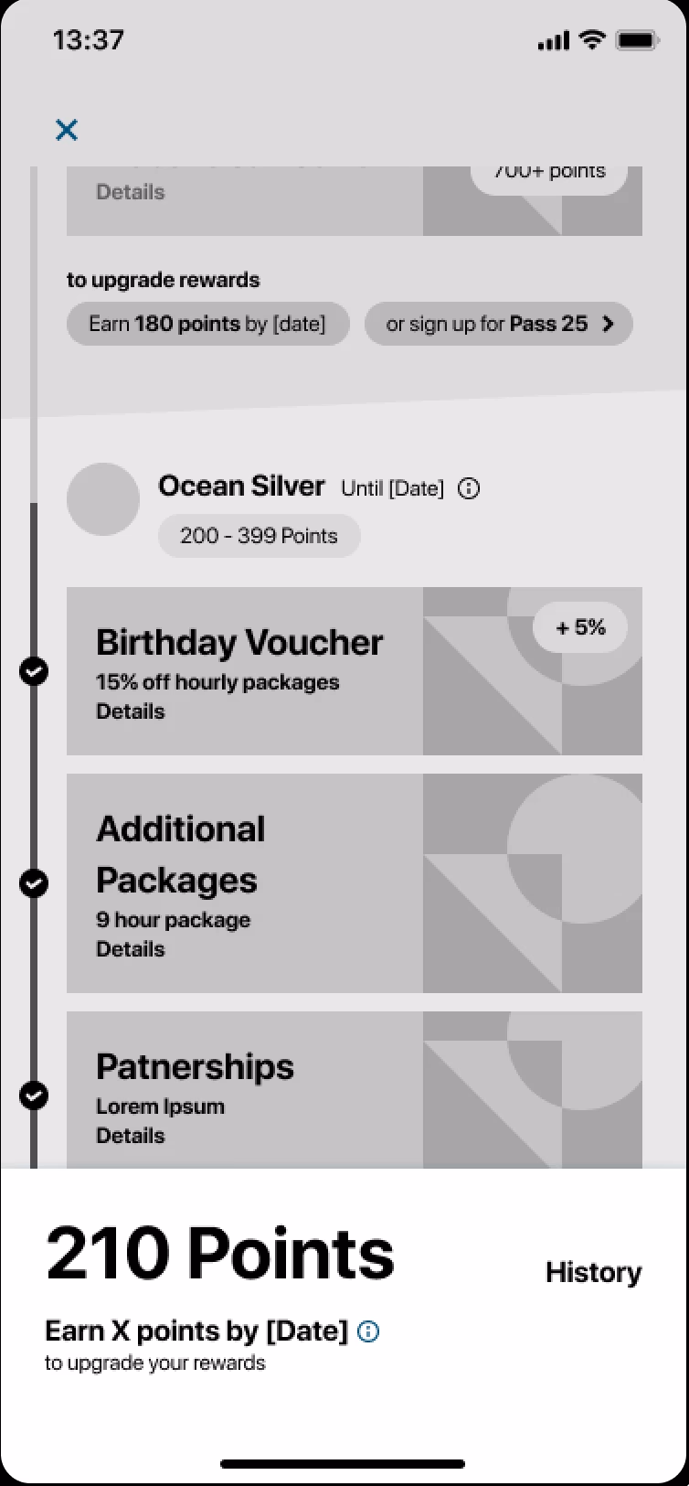
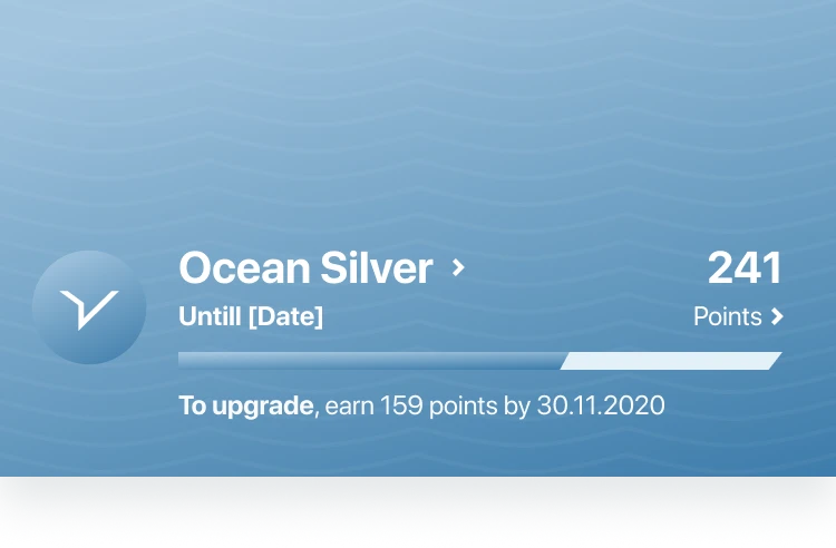
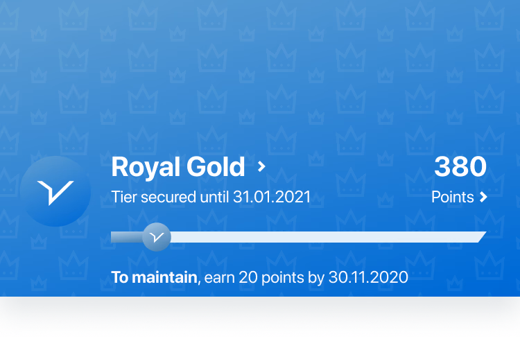
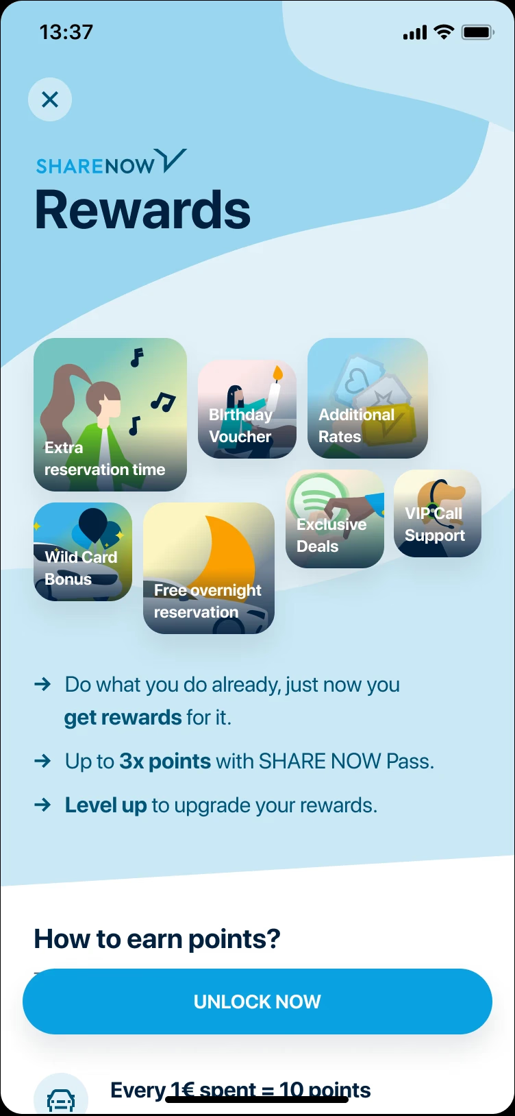
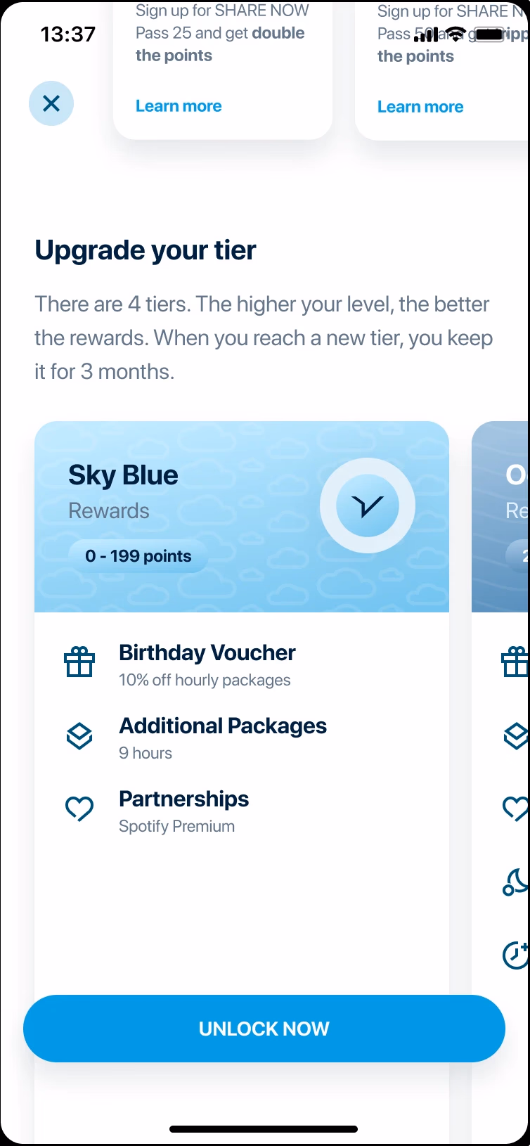
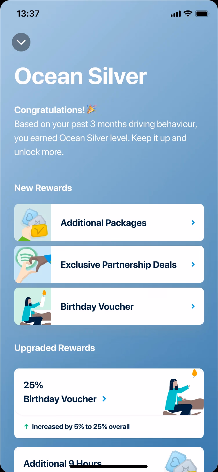
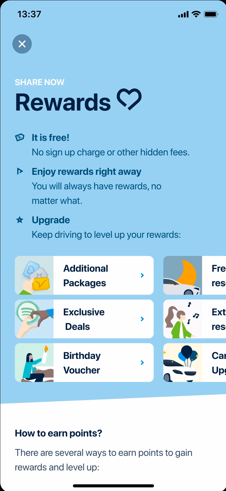
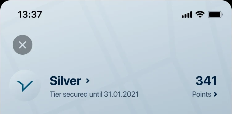
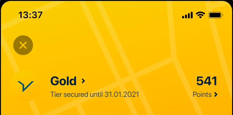
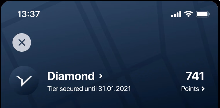
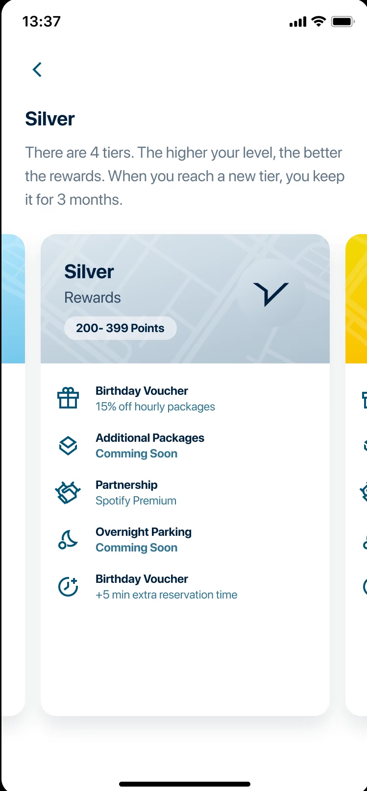
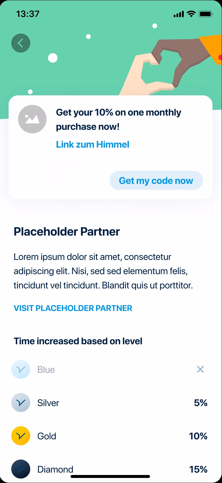
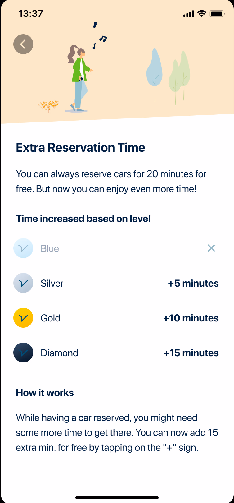
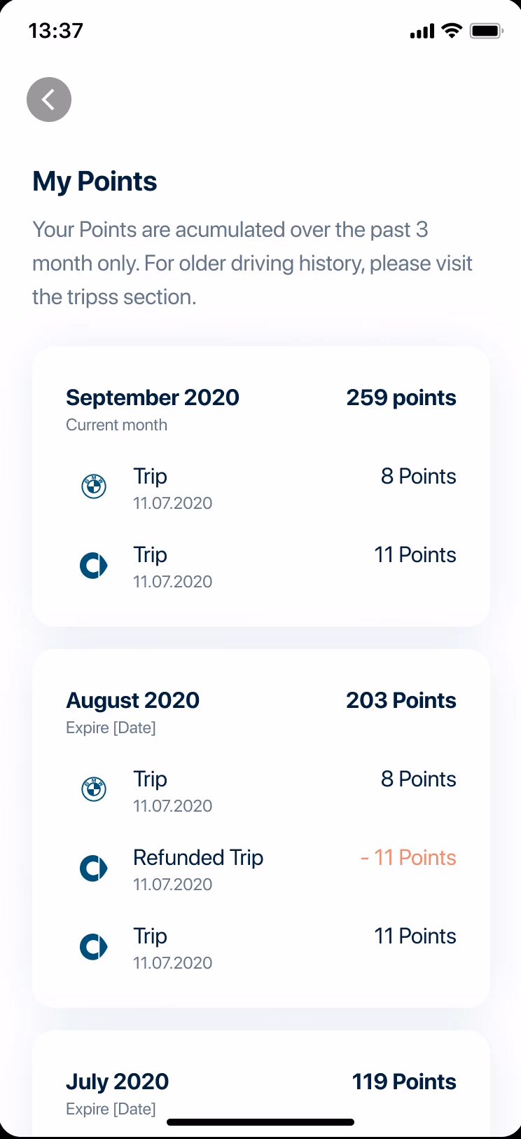
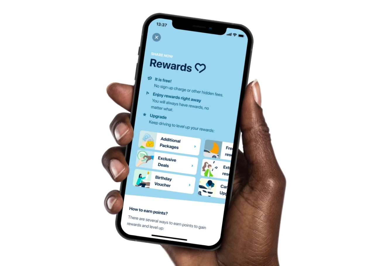
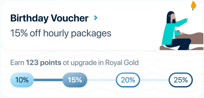
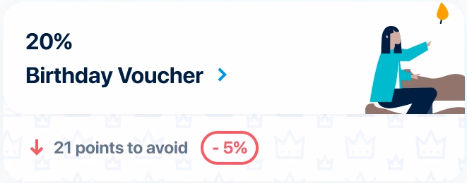
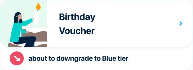
Earn more, feel the rewards sooner.
SHARE NOW was building their loyalty program from scratch — core mechanics already defined when I joined mid-discovery. I stepped in to ensure we'd ship something users would actually engage with, not just output that looked done.
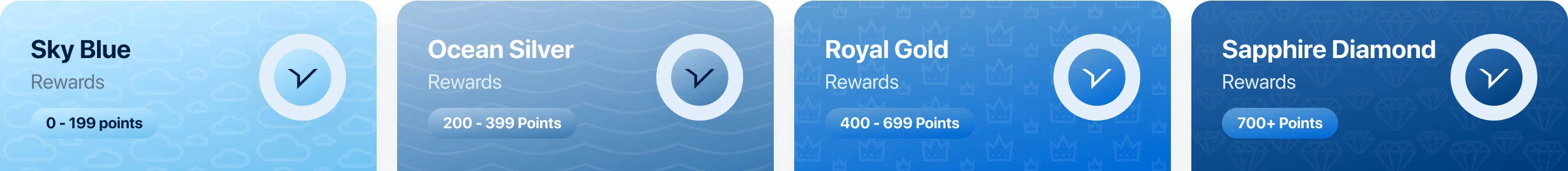
SHARE NOW · 2021 · 3 months
Starting Point
The program's core mechanics (points, tiers, colors, names) were predefined but unvalidated and not fully assessed for feasibility. With a tight timeline, I negotiated a short window for qualitative testing to validate assumptions and de-risk delivery.
Clarity
Do points → tiers → rewards make sense and motivate users to drive more?
Awareness
Will users know the loyalty program exists?
Compliance
No auto opt-in (GDPR/T&Cs).
Hypothesis
Driving more and longer trips increases engagement and loyalty.
Signing up for Rewards strengthens retention and repeat usage.
Initial Concept
Marketing's tier names and colors were set. Within a blue-first brand, "Silver/Gold" created confusion. I secured time to test whether naming and color supported a clear, motivating hierarchy.
Testing — Round 1
Goal
Discover usability problems and assess the impact of the loyalty concept on user motivation.
Set-up
Prototype
Learning 01
Low emotional investment in tiers
Users cared most about rewards.
Learning 02
Names and colors
Misaligned with mental models.
Learning 03
Points → Rewards connection
Weakened by tier-first framing.
Iteration
Onboarding
Lead with benefits, downplay tiers.
Status
Make current points/tier clear and discoverable.
Visuals
Harmonize tier names/colors with subtle motifs; clarify headers and cards.
Sketching & Wireframes
UI Improvements
Tier name & color support
Introduced subtle watermark patterns to reinforce tier identity while staying within SHARE NOW's blue-centric palette.
Header & status clarity
Enhanced the dashboard header to clearly communicate current points and tier status at a glance.
Reward cards
Experimented with reward cards to indicate potential gains/losses.
Teaser page
Shifted teaser page focus from tiers to rewards, highlighting immediate benefits for new users.
Testing — Round 2
Goal
Validate potential solutions to previous findings and identify further usability issues.
Set-up
Prototype
Learning 01
New teaser page
Clearer, but users were still overwhelmed.
Learning 02
Effort → Reward
Participants better understood the link between effort and rewards.
Learning 03
Tiers & Next Steps
Users could identify their tier and next steps, but progress tracking remained unclear.
Learning 04
Marketing aligned
Clearer benefits; better effort→reward understanding; progress still fuzzy. Marketing agreed to revisit names/colors.
Iteration 2
Teaser & tier calculation
Show sign-up cost, immediate rewards, and visible progress; add background feedback and optional push notifications.
Dashboard & tiers
Expanded naming and color options to reduce mental load while maintaining brand alignment.
Reward presentation
Clearer access to both partner and internal rewards.
Points
Added empty states and explicit progress tracking to make the path to rewards tangible.
MVP Launch
The MVP went live with key features, while some (like nudging users) were scoped out due to engineering constraints. These could be added later to further drive behavior change.
Key Take-Aways
Hypothesis-driven and outcome-oriented approach paid off. We treated early misalignment (tier focus, color naming) as learning, not failure. Validated assumptions quickly, and iterated to emphasize rewards, clarity, and measurable behavior change.
01
Test early
Delayed UX testing caused frustration but validated critical assumptions.
02
Prioritize MVP features
Focus on must-haves, iterate quickly.
03
Collaboration is key
Success relied on marketing, sales, UX research, and engineering working together.
04
Design for clarity
Users respond best when benefits are clear and tier mechanics are simplified.