Share Now app rate selection screen

Making Longer Trip Rates Easy to Find, and Worth It

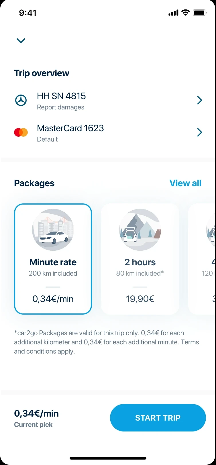
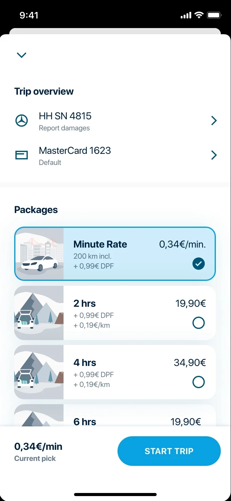
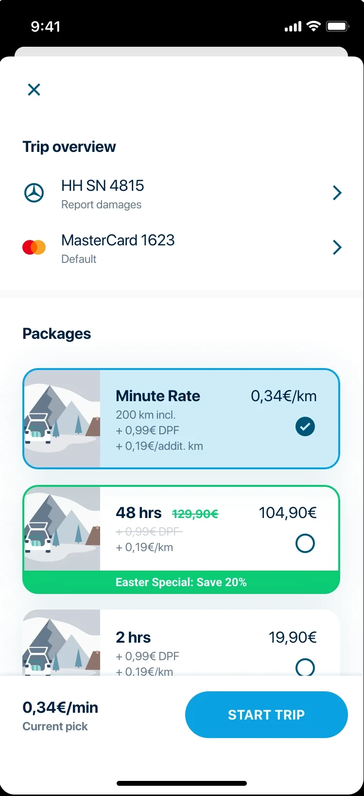
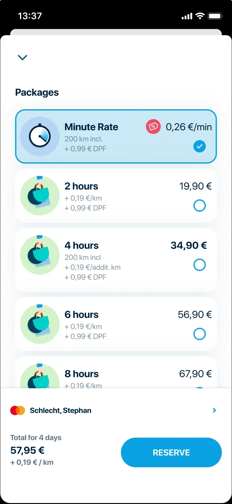
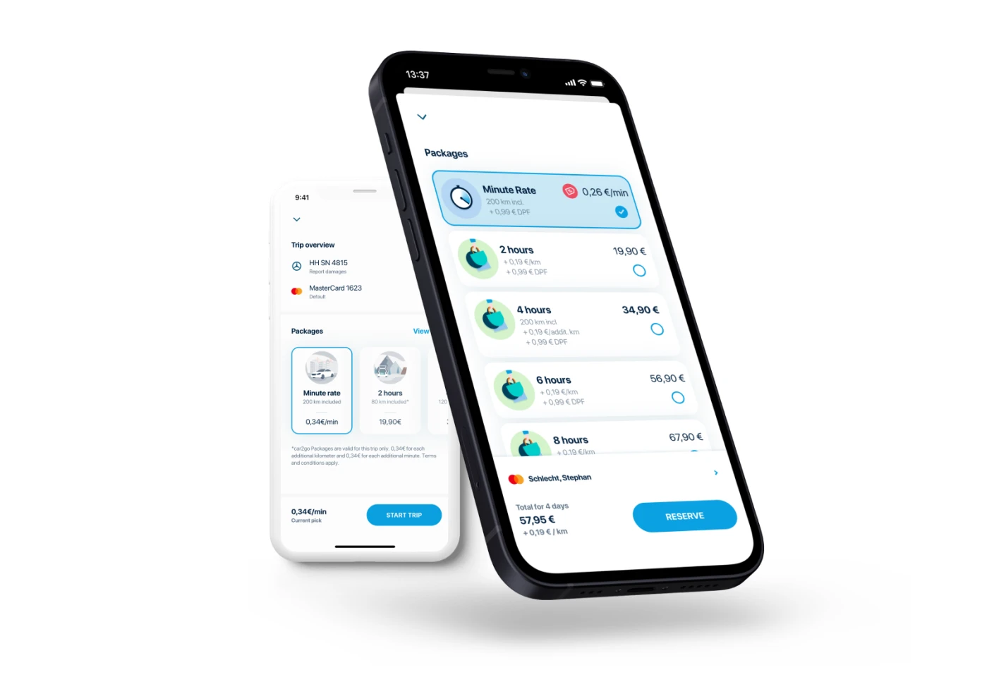
A cluttered carousel was hiding the value of hourly and daily rates.

By making rates the primary screen focus and switching from a carousel to a vertical list, we reduced mental load and improved discoverability.
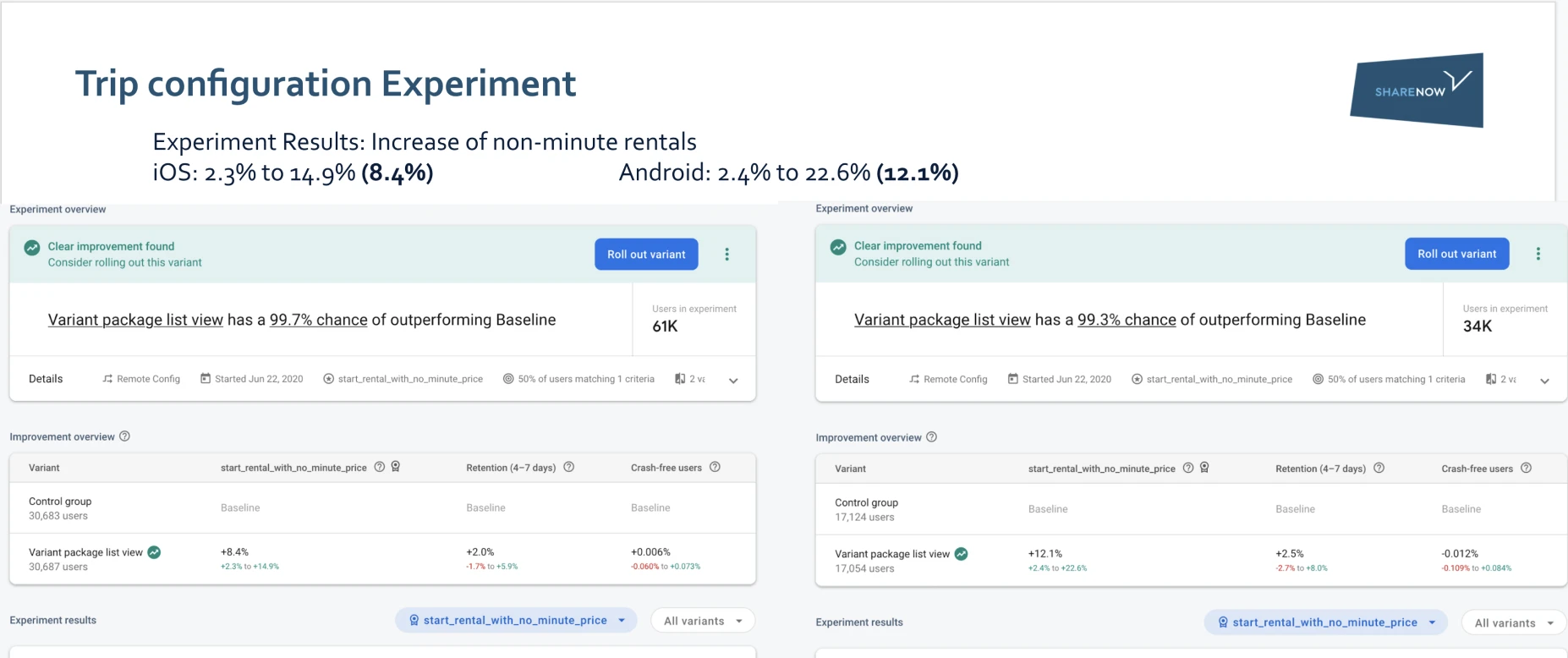
+8.4–12.1% increase in non-minute rate selection · iOS +8.4% · Android +12.1%

Share Now · 2022 · 2 Months

UX Concept Wireframes + Prototype Visual Design Stakeholder Management

Starting Point

With the initial design, adoption of non-minute-based rates was low. We identified several issues in the current design through user interviews and heuristic evaluations.

Original rate selection screen showing carousel layout and cluttered UI

01 · Issue

Lots of noise around the main task

Users are presented with rate options on the bottom half of the screen, competing with too many surrounding elements.

02 · Issue

Lack of flexibility in visible content

The cards are not flexible in terms of size and components shown. This makes it difficult to present special offers in the app.

03 · Issue

Lack of information about offered rates

Late fees and additional km costs are not configurable for individual rates. The user is expected to read a footnote hidden on smaller screens.

04 · Issue

Carousel makes comparison difficult

Only a few options are visible at a glance, making comparisons difficult. This form of display is also not suitable for large amounts of content — 35 or more rate options.

How Might We

With the business goal of selling more hourly and daily rates, we started an experiment by setting up an A/B test to validate whether layout changes alone could shift selection behavior.

Approach

Before building, we aligned on what success would look like. These goals defined both the direction of our design decisions and the criteria we would use to evaluate the A/B test results.

Goal 01

Reduce mental load

Make the rates the main element on the screen. Remove or deprioritize everything competing for attention.

Goal 02

Increase focus on rates offered

Declutter the screen of secondary actions. The rate selection decision should be the primary and only task.

Goal 03

Increase UI flexibility

Set up the screen to handle potential future feature requirements — special offers, promotional rates, and upselling.

Round 1

For the first experiment, we changed the layout from horizontally paging cards to vertically scrolling options to support more natural scrolling behavior.

Two immediate improvements followed from the change in layout pattern:

Round 1 variant A — control: horizontal carousel layout Round 1 variant B — new: vertical scrolling list layout

Improvement 01

Increasing the number of rates visible at page load

The vertical list shows more options without requiring a swipe — users can immediately scan the full range of available rates.

Improvement 02

More scalable design due to flexible card height

Unlike fixed-width carousel cards, vertical list items can accommodate additional information, badges, and special offers without layout strain.

Assumptions Tested

To validate our assumptions, we ran an A/B test between the original carousel layout and the new design. We deliberately decided against user testing first, as there is plenty of research available around the UI choices we made and qualitative data would have had little impact.

The two assumptions we were testing:

Assumption 01

Users are unaware that our service offers more than minute-based rentals.

Assumption 02

Users are interested in using our service for longer trips in addition to minute-based rentals.

Learnings

After two weeks of full rollout, the results were in. The small changes were a big success on both platforms.

+8.4% iOS users opted for non-minute rentals more than before Hourly and daily rate selection, full rollout cohort
+12.1% Android users opted for non-minute rentals more than before Stronger effect on Android — possibly higher baseline discoverability gap
Round 1 experiment results

Round 2

To further improve the screen's performance, we ran a quick round of user testing to learn what, if anything, was still distracting users from making a choice. Based on the results, we cleaned up remaining elements not directly involved in rate selection.

Adjustment 01

Payment profile relocated

Relocated closer to the price to be paid, putting it in a more logical and expected position.

Adjustment 02

Damage reporting removed

Removed the damage reporting entry point. Most users are not in front of the car when selecting a rate, making this action irrelevant in context.

Adjustment 03

Illustrative icons added

Added illustrations to provide visual support for generic use cases, making each rate option feel more tangible.

Round 2 refined design with payment profile relocated and damage reporting removed

Illustrative icons for visual clusters

Use case illustration 1 Use case illustration 2 Use case illustration 3 Use case illustration 4

Takeaways

Some of these iterations were minor and did not revolve around a complex change in flow. But working toward a clear goal incrementally, while constantly comparing to the status quo, is what made the outcome measurable and defensible.

Across both rounds, the combined changes produced an overall uptick of around 1%.

Incremental iteration compounds

Small bets, clearly measured, add up.

Working towards a clear goal in an incremental way while constantly comparing to the status quo is a great way to measure success. Even minor UI changes can produce meaningful behavioral shifts when the right metric is tracked.

A/B testing bounds your risk

Every bet comes with a safety net.

By running A/B tests, the risk of fallout is limited, as there is always the option to revert to the previous version. Each incremental step forward can be viewed as an educated bet with a safety net.

Next Case Study

Personalization

9/10 participants would add trackers in real life

View case study →
Personalization case study thumbnail