Personalization
Track what matters, faster.
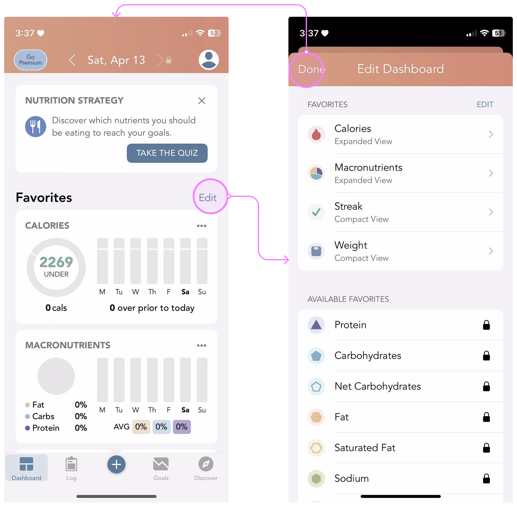
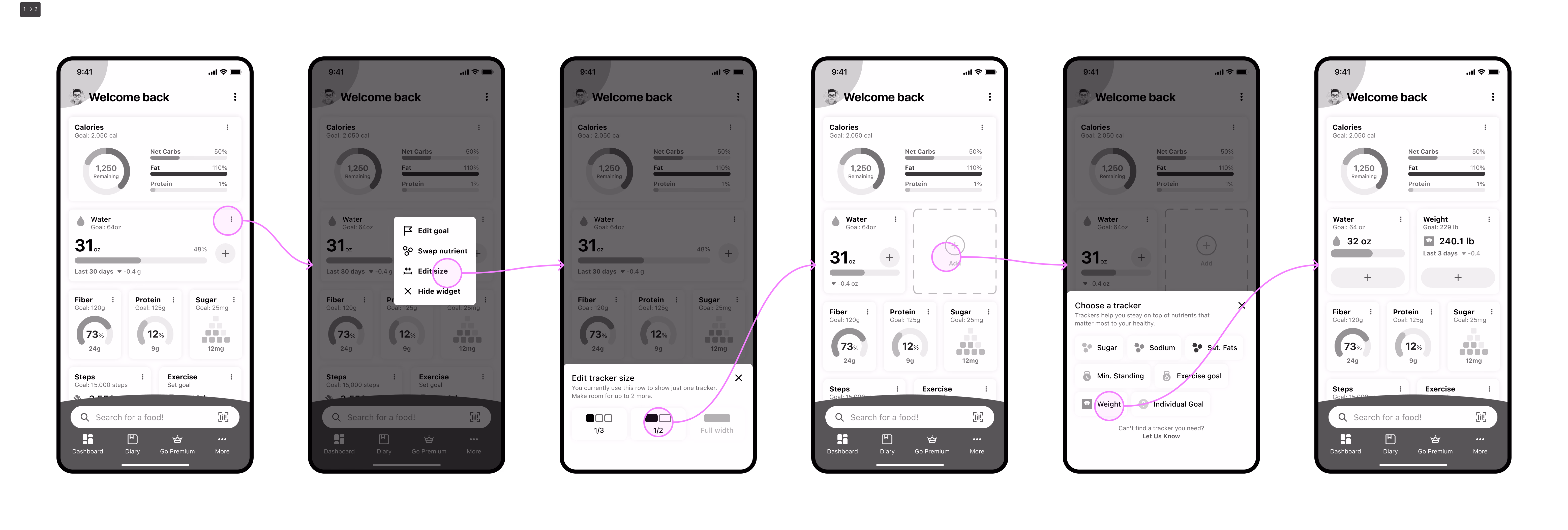
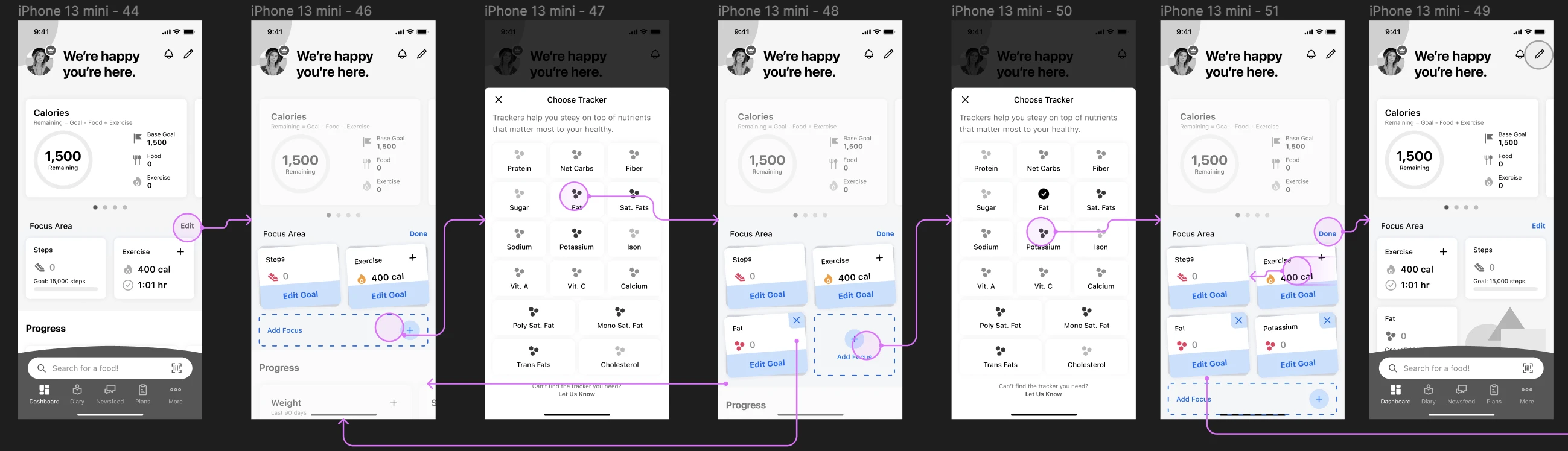
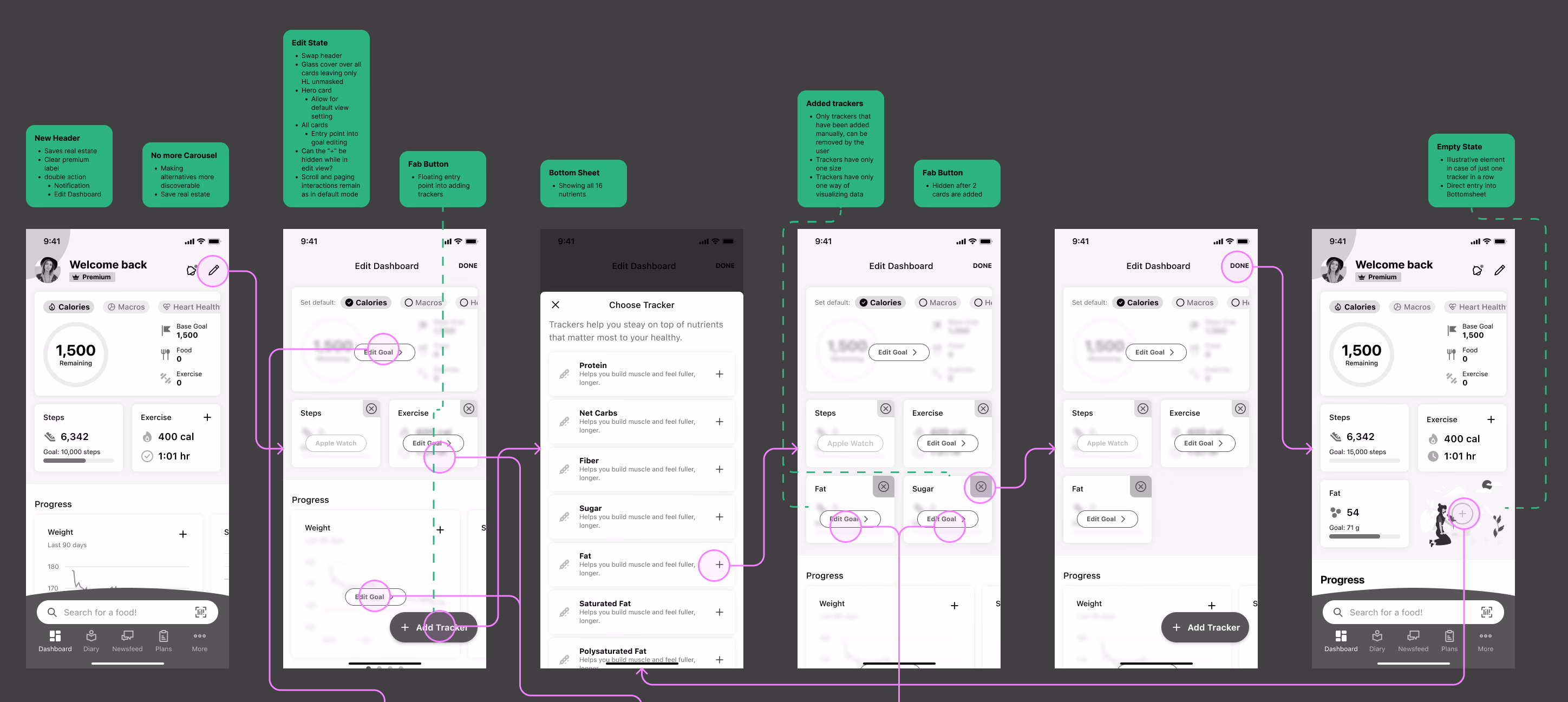
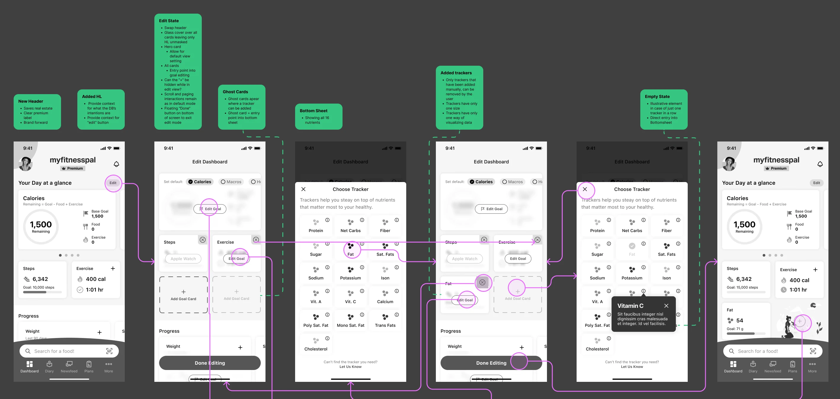
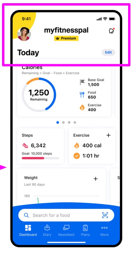
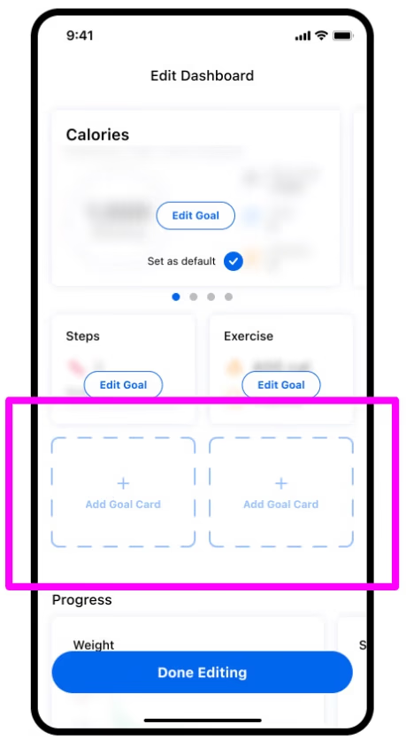
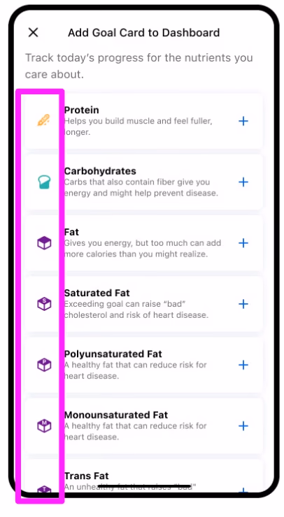
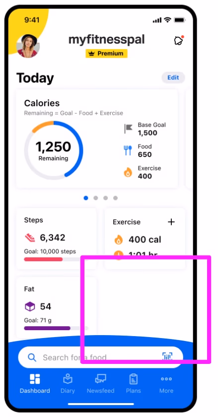
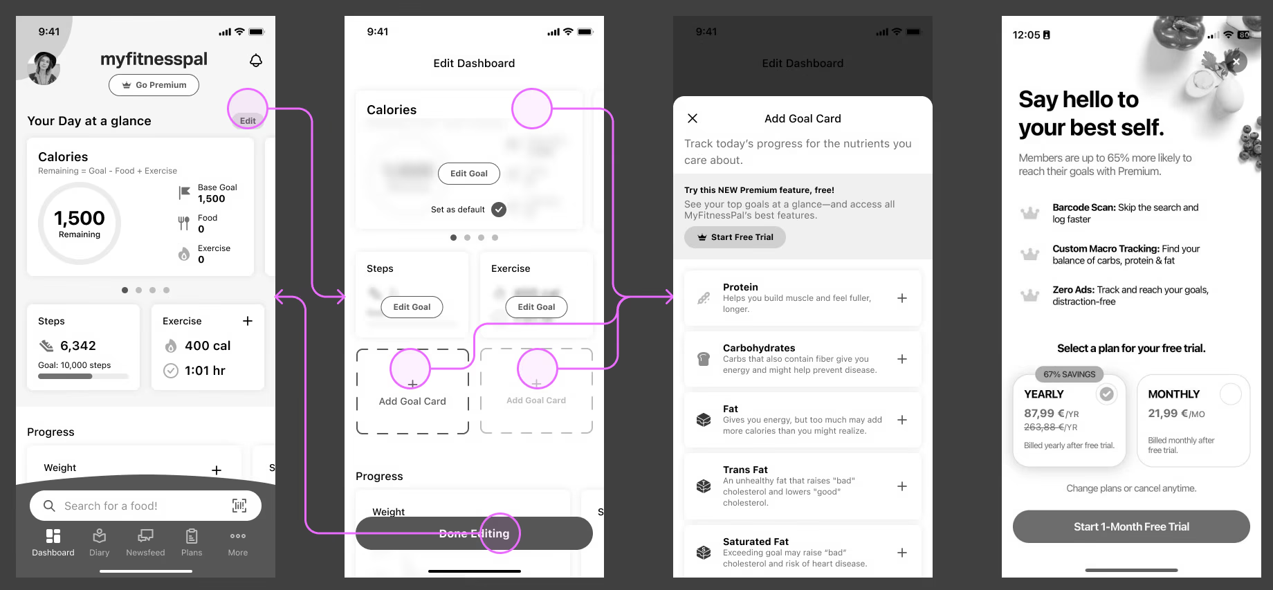
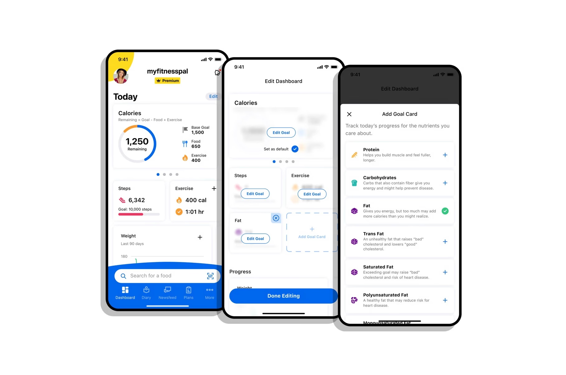
We redesigned MyFitnessPal's dashboard to make nutrient tracking intuitive, focused, and discoverable — merging the best of two prototypes into one shippable solution.
9/10
Participants showed strong interest · would add trackers in real life
MyFitnessPal · 2022 · 2 months
UX Concept
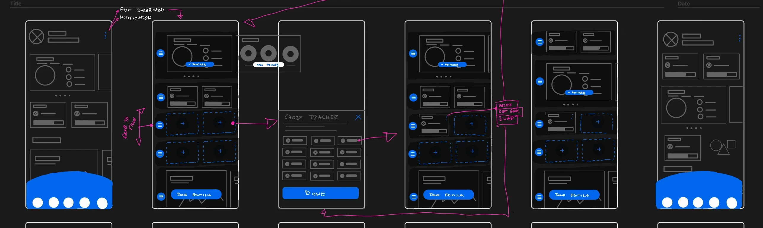
Wireframes + Prototype
Visual Design
Stakeholder Management
Discovery